The role of posters in video game worldbuilding

Symbolic of a larger universe, video game posters provide the gateway to a more expansive world.
Culture
Words: Ewan Wilson
Remedy Entertainment’s new action-adventure game Control is all about confronting a world considerably larger than we first imagined. Central to this idea is the image of the room and the poster. Referencing the 1995 film The Shawshank Redemption – where behind the pin-up on his prison cell wall, Andy Dufresne slowly chisels a hole to the outside world – the poster in Control is a gateway to a more expansive universe.
Exploring Control’s principle location, a vast, labyrinthine government building, you’re quickly acquainted with all kinds of office life: typewriters, swivel chairs, branded coffee mugs, and plenty of faintly threatening workplace posters, many of which are information notices, laying out the arcane elements of the Bureau’s work culture and bureaucracy.
These in-game posters perform a similar function to the metaphorical one on the prison cell wall. Alongside various made up advertisements, brands, book covers and propaganda signs, posters are symbolic of a larger universe, helping to broaden and flesh out any fictional world. An incredible amount of effort is put into creating video game settings, and the poster is but one of many tiny details carefully designed to draw you deeper.
Jenna Seikkula, a concept artist on Control and designer of many of the game’s office posters, tells me that her work formed a key part of the world-building process, expanding the players’ experience and enhancing the narrative.
“The posters portray – in a kind of funny, but also disturbing way – the inner tendencies of the Bureau,” she says.
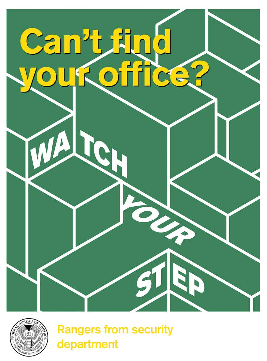
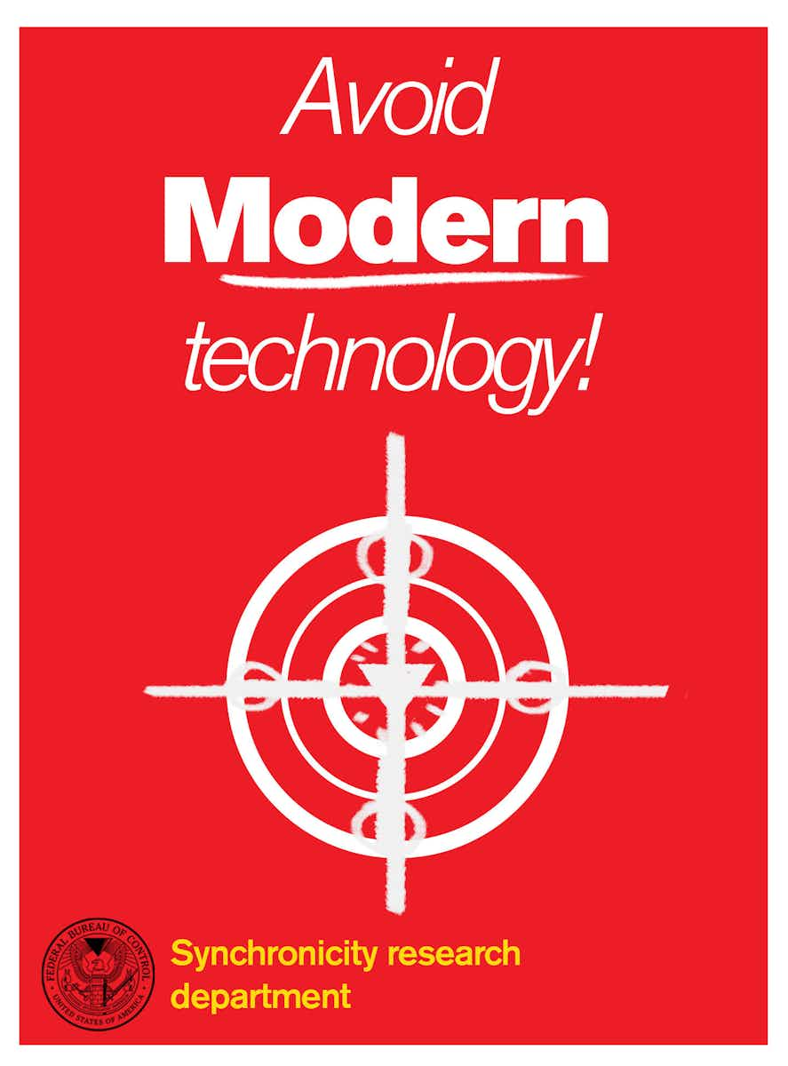
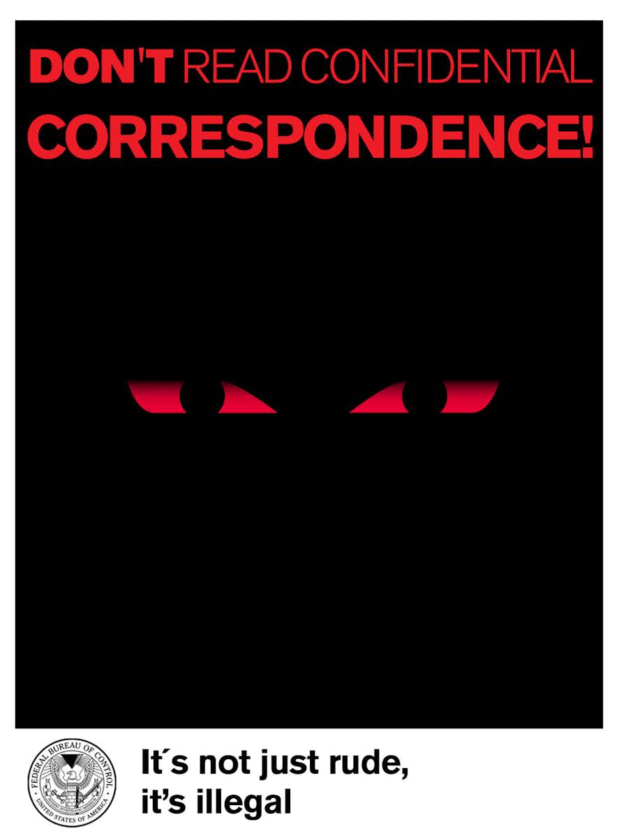

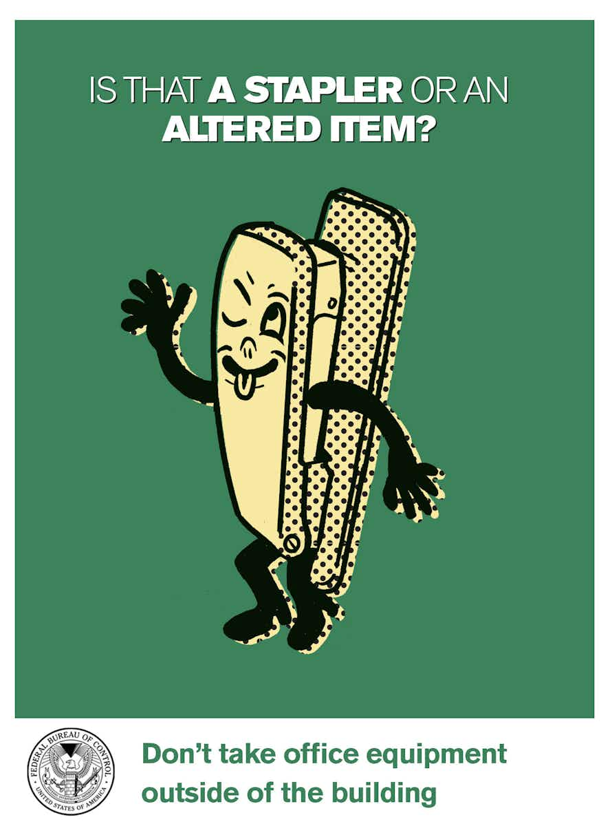
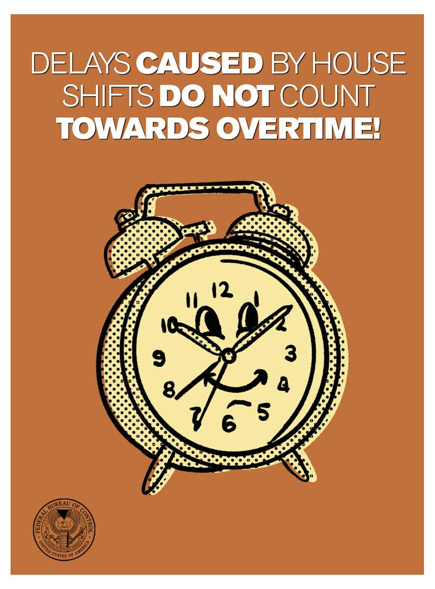
Creating a functioning three-dimensional building that constantly shifts poses difficulties, and so things like the office info posters can communicate these complex elements of the world in a more cost-effective manner.
“For the ‘WATCH YOUR STEP’ poster, I had the task of illustrating the impact of the building shifts on workers, so I decided to play with the geometric outlines of it, followed by the uncertainty of being lost in a place like that.”
When creating the posters Seikkula looked to propaganda designed by both the United States and Soviet Union between 1940 – 1960. “The idea was to catch the essence of them without making the game posters look vintage. I wanted to have a contemporary look but with a twist.”
Also important to their design was the Finnish idiom “pilke silmäkulmassa”. “It roughly translates to something like a ‘sparkle in the corner of your eye’,” she says. “It refers to the act of doing something with a level of humour.” This is why Seikkula’s favourite posters are the three with anthropomorphised characters: the mischievous stapler that cannot leave the building, the friendly clock which represents something darker, and the smiling mold that foreshadows events to come.
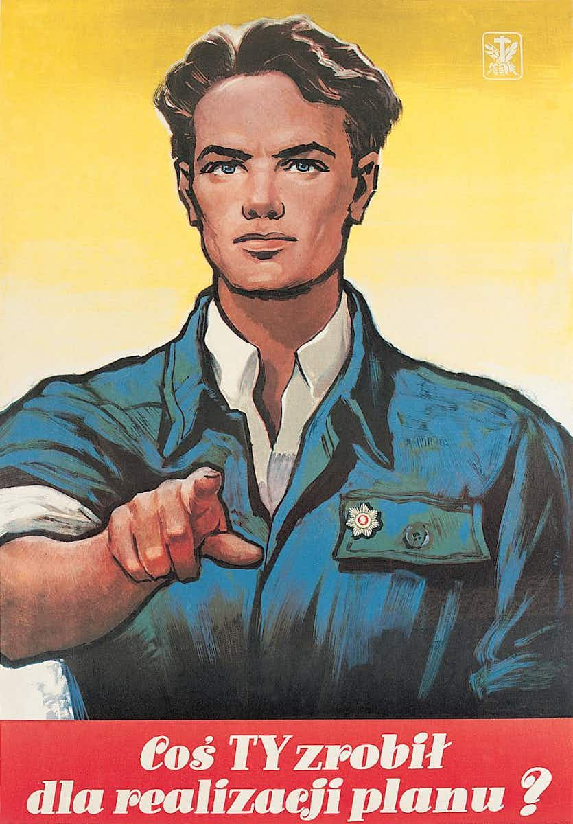
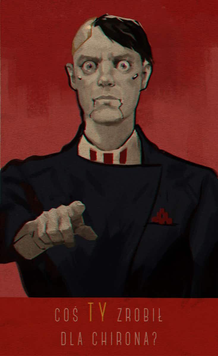
The Polish cyberpunk-horror game Observer is another example of potent worldbuilding. Bloober Team’s Art Director Mateusz Lenart tells me that they had a huge, natural base of inspiration. “The Polish poster school was famous during the Polish People’s Republic (PPR). At the same time we referenced the propaganda posters used by the post-war Soviet government.”
One of Lenart’s favourite posters is “Coś ty zrobil dla realizacji planu”, or “What you’ve done for Chiron?”, which depicts a working man pointing his finger at the viewer as if accusing them. Based on an iconic PPR poster – “What you’ve done for the great plan?” — Mateusz makes it clear that in Observer’s gritty future “the mysterious company Chiron has taken over the role of the Soviet state”.
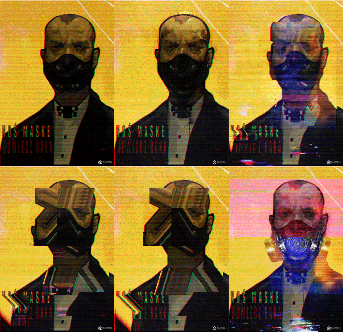
Observer also features a number of animated posters. “Pawel Kot was responsible for the animations, and he did a great job showing their glitchy psychedelic nature,” Lenart says. “Our goal was to show the mental state of the protagonist. They were highlighting his greatest fears and reminded him of the things he was trying to erase from memory.”
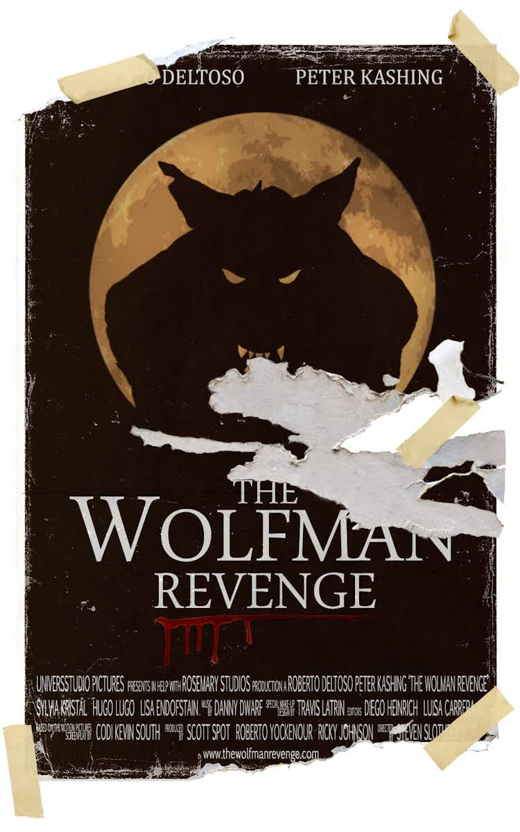
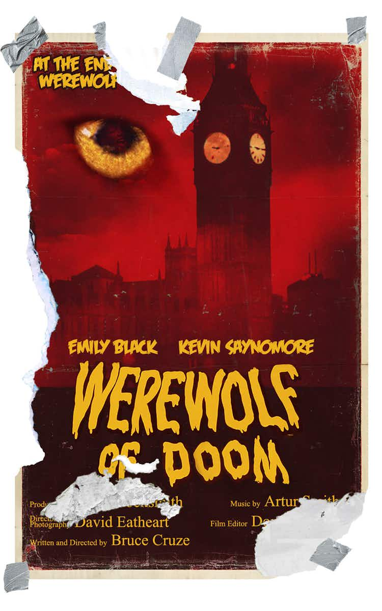
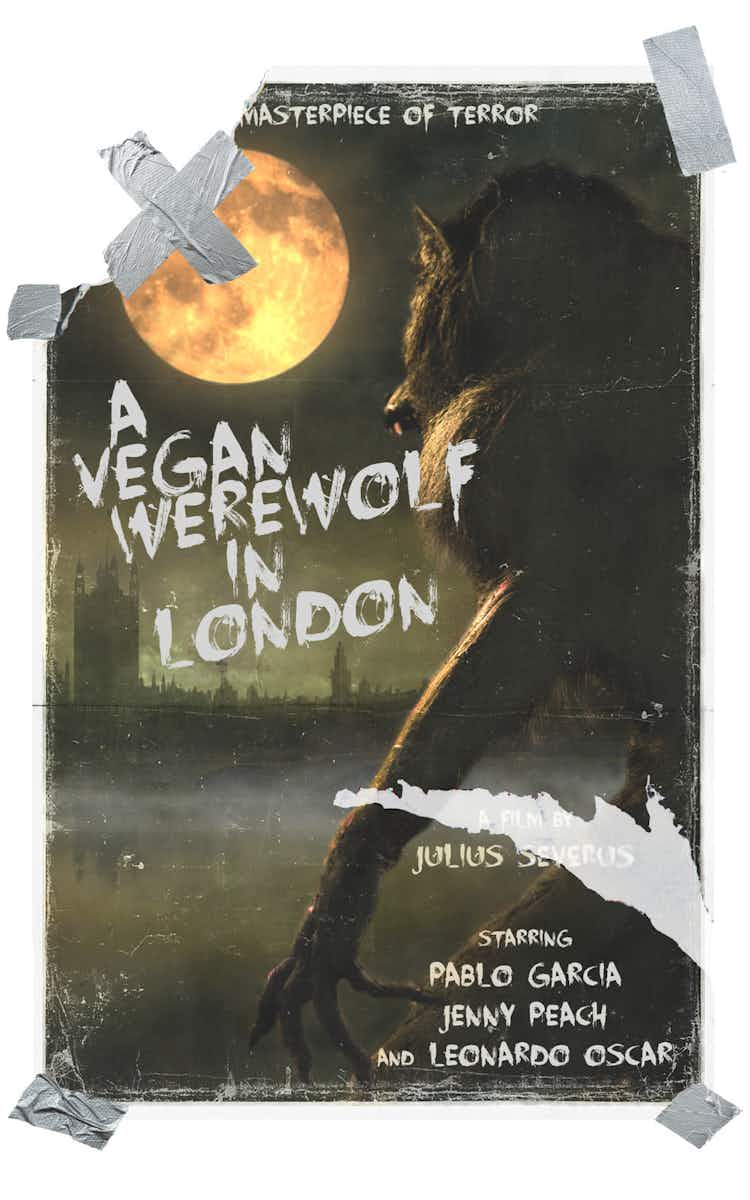
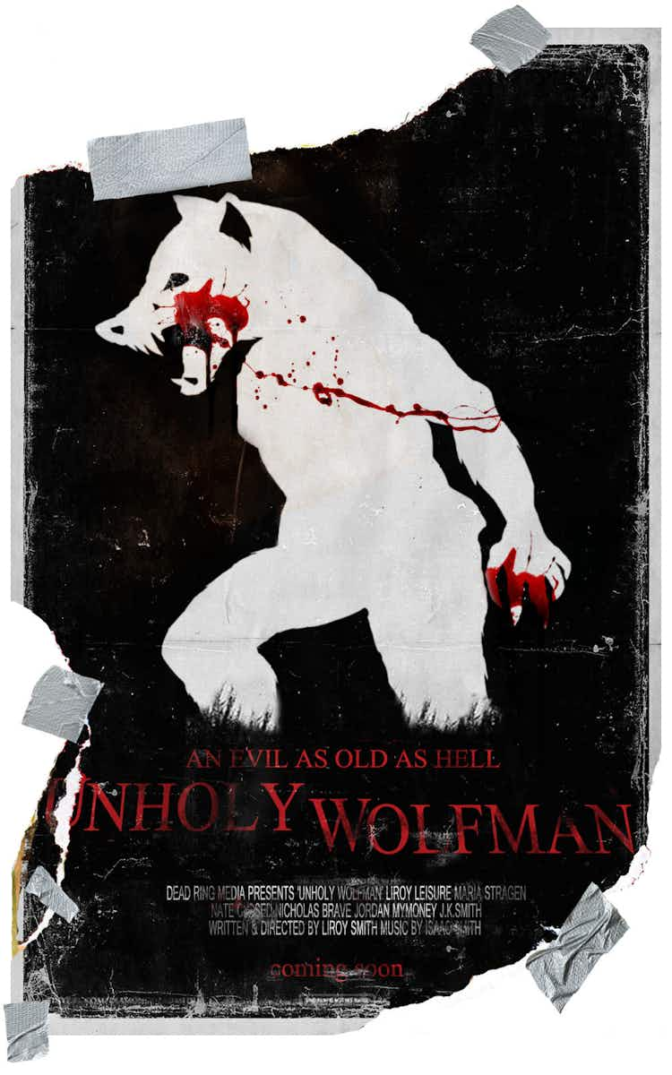
Kot was also responsible for many of the Werewolf film posters dotted around the game’s dilapidated Kraków apartments. The images foreshadow a later encounter with a bestial antagonist, but could just as easily symbolise the anxieties of the protagonist worried about his own transformed body.
“Posters were a great tool for us to build a story and establish the world design. In one way, they show how this future world is organised, the rules of it etc. but they also represent the protagonist’s various dilemmas,” Lenart explains.
While first-person shooter Wolfenstein has been around since 1992, it’s only with MachineGames’ recent set of games that we’ve seen a focus around narrative and world-building. Propaganda posters and fictional brand advertisements play an important role in fleshing out the game’s alternate history where Hitler and the Nazis won the war and continued on to global domination.
“The key ingredients to our poster design is that they’re memorable, interesting, tell a story, and expand the player’s perception of the fictional world we’ve created,” explains Axel Torvenius, art director on all three of MachineGames’s Wolfenstein games. “If done right, [the posters] can help convey everything from small trivial details to the broader story arc. These aspects enrich and deepen the lore and the world.”
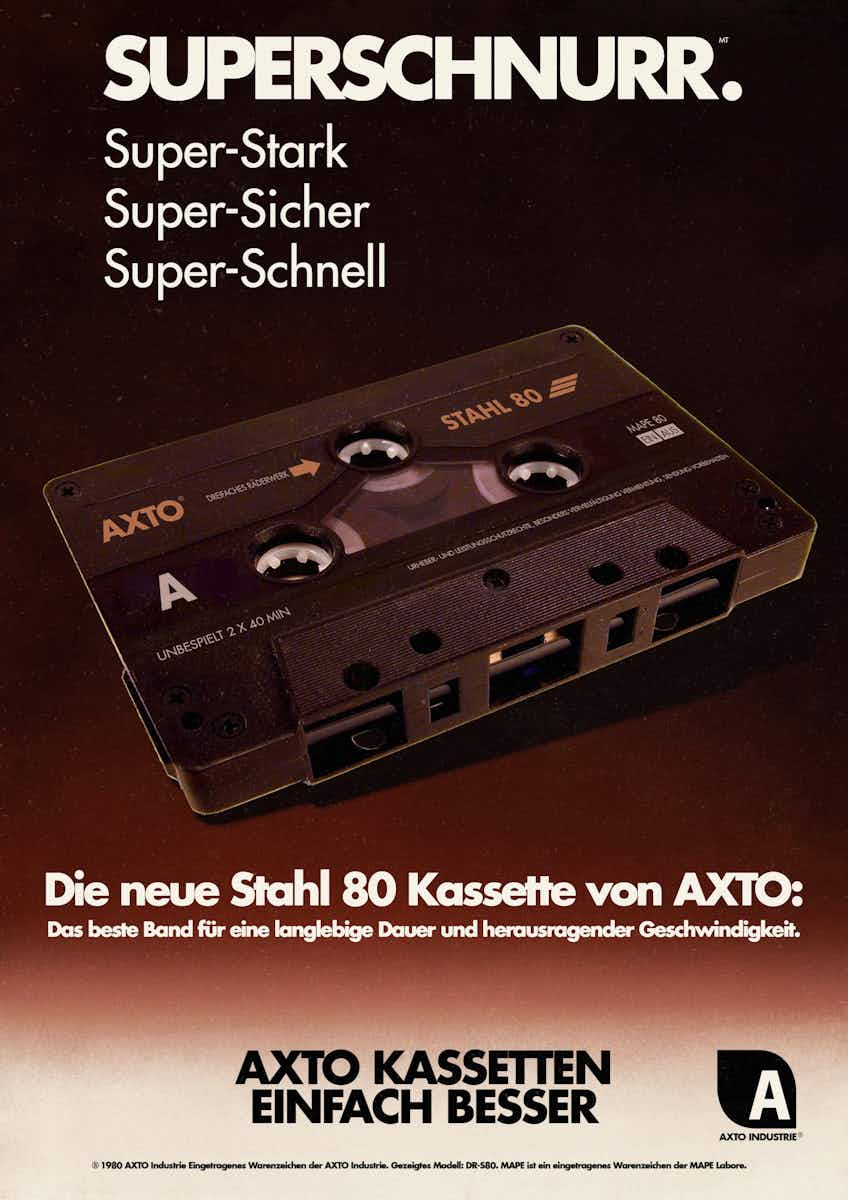
The most recent game in the series, Youngblood, is the first to be set in the ’80s (an alternate one dominated by the Third Reich). “It was a challenge, but a lot of fun. Trying to capture the mood of an ’80s world conquered by a technological Nazi empire was interesting. It can’t be too cheerful, since that wouldn’t chime too well with the overall tone, but it also can’t be too dark and gritty since that would lose some of the ’80s playfulness,” Torvenius says. “We looked at a lot of stuff produced in the ’80s. The works of John Carpenter, for example, were a good reference, since his works from that era are dark and gritty, but still have that distinct period style.” On top of this the team tried to add more light-hearted, pop culture references to achieve the dark humour the series is known for.
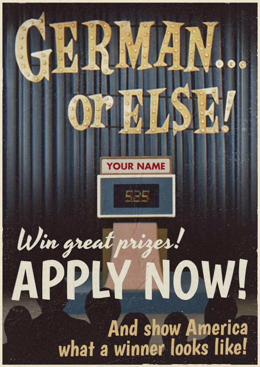
2017’s The New Colossus introduced a fictional TV game-show called German… or else!, which grilled American citizens on their German language skills, with the promise of prizes (or imprisonment). “German… or else! is a stroke of genius by our marketing department. I think it captures that dark humour we’re always playing with,” says Torvenius.
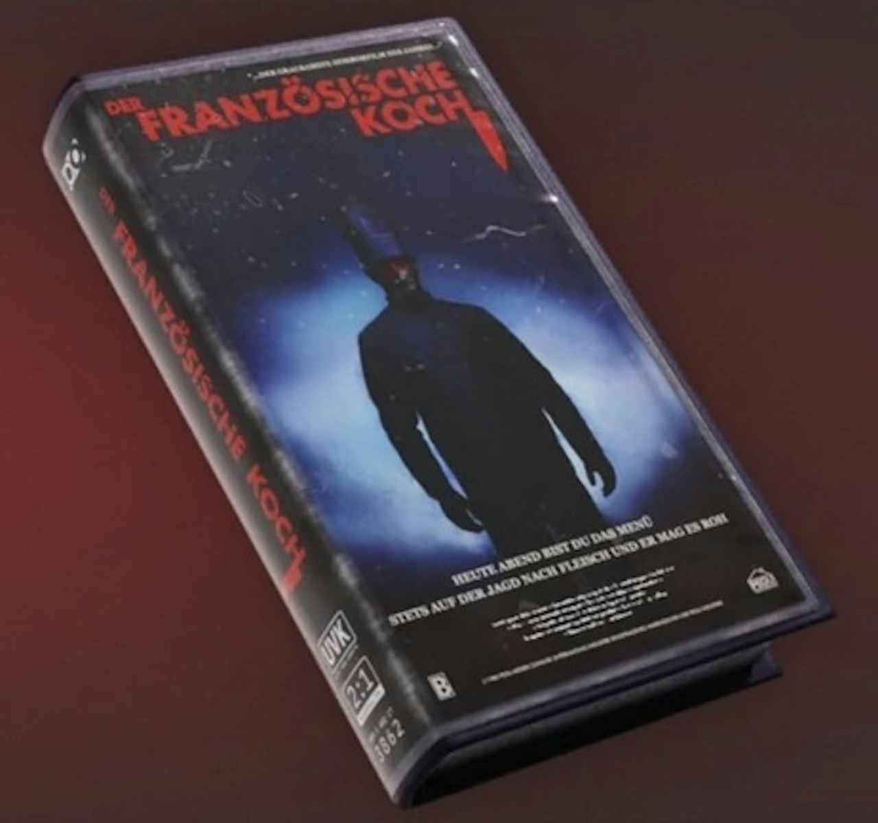
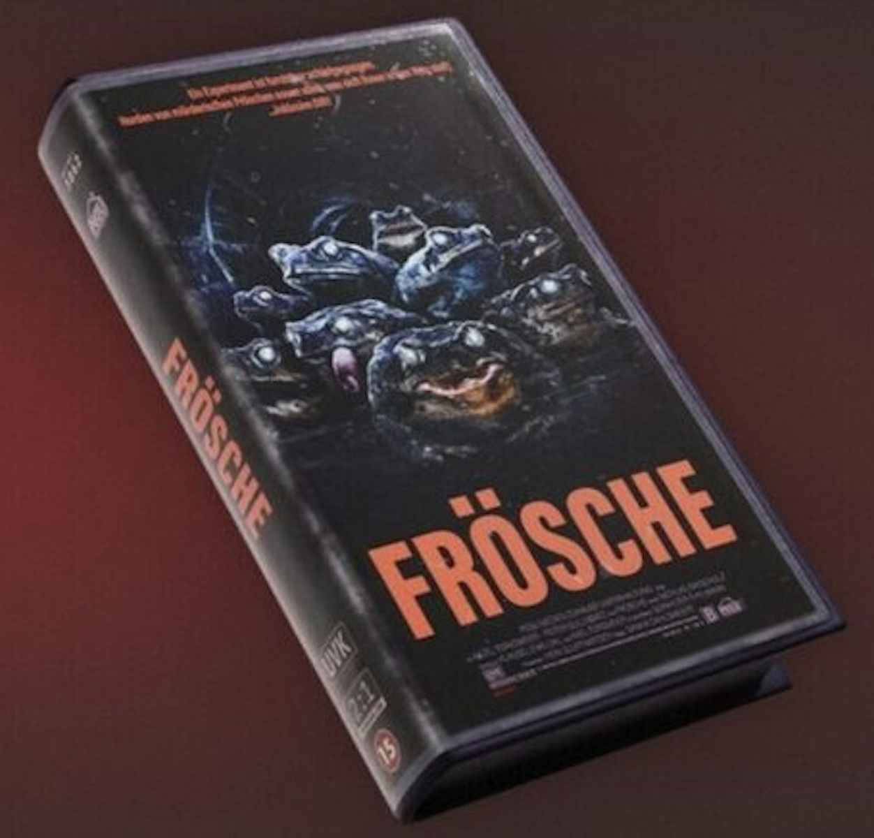
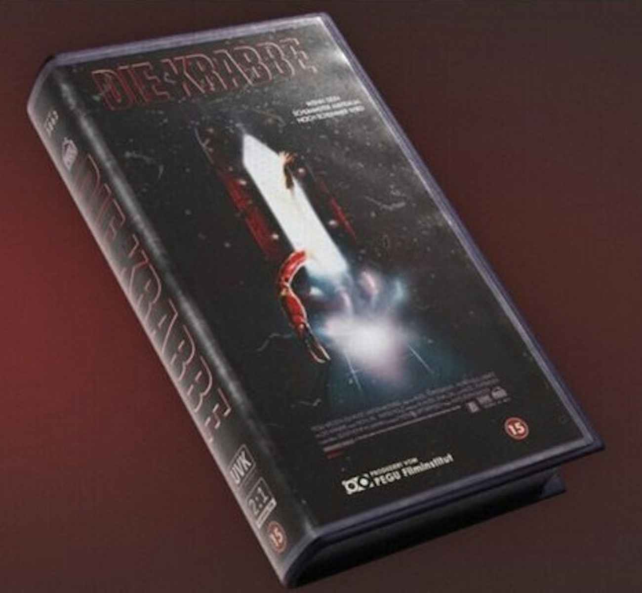
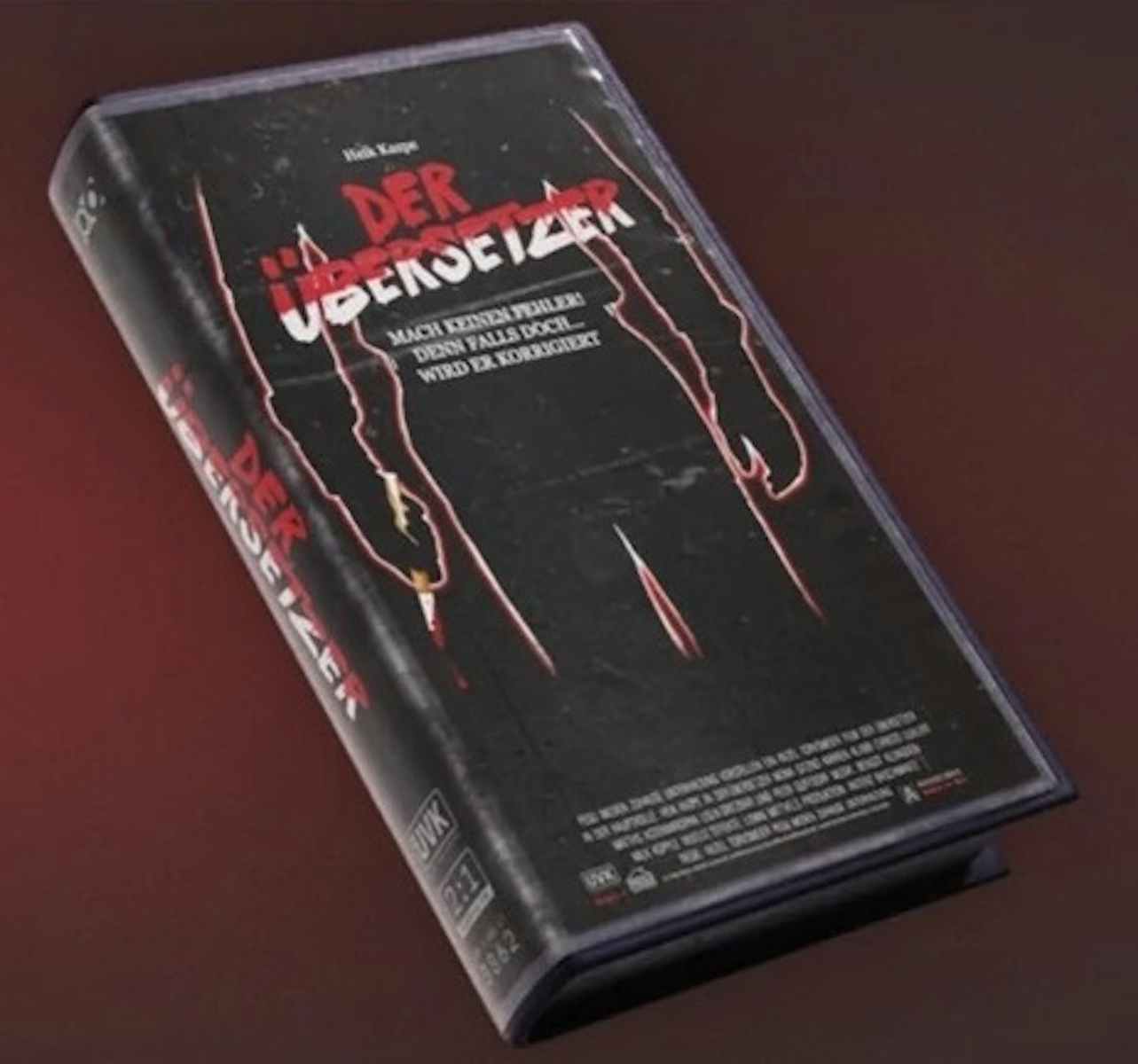
From Youngblood, the commercial posters for LASER FLOP and various other ’80s analogue tech were Torvenius’ favourites. He’s also a fan of the collectible “UVK” film covers that the art team designed, many of which reference different John Carpenter slasher movies as well as cheesy Hollywood action flicks.
All of these fictional details hint at larger worlds existing just off-screen. While there’s an element of illusion at play here, posters are an effective way of reinforcing a game’s themes, easing players into a virtual space and even foreshadowing things to come. The explorable space of the game itself is like the room or prison cell, while the poster – two dimensional as it is – represents something much greater.


