How the Stanley Kubrick carpet is invading video games

Leveraging the power of hypnotic geometry and enigmatic patterning, video game developers look to the infamous carpet and super-considered design in The Shining to enchant and intrigue.
Life
Words: Ewan Wilson
Human beings like a good pattern. Our eyes are drawn to them, and our brains are hardwired to recognise them to make order from the chaos of nature. Sometimes this is just “patternicity”, the tendency to find patterns in meaningless noise, kind of like the ultimate comfort blanket.
At other times, patterns are intentional – a sign of human habitation. Borrowing from physics and psychology, interior designers often talk about the “complexity” of a scene. Various designed elements work in conjunction to make a space feel more appealing. A bare floor or wall, randomly cracked and splintered, doesn’t appeal to us the way a good carpet, rug or wallcovering might.
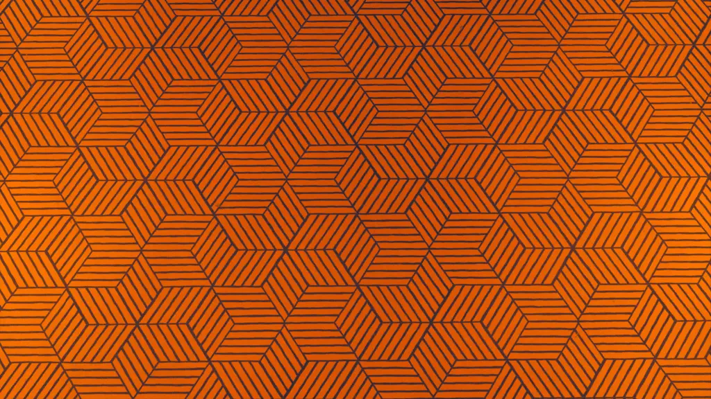
One pattern that seems to knock everyone dead is the carpet from Stanley Kubrick’s The Shining. You know the one: a maze of garish orange hexagons, winding its way round the illogical space of the Overlook Hotel. It’s one of the most referenced carpets in film history, from Pixar’s original Toy Story to the Oscar-winning Birdman, and now video games are paying homage too.
The pattern appears on spooky wallpaper in The Evil Within sequel, as well as in 2019’s Layers of Fear, where it pops up in a short scene that also includes Danny’s famous tricycle from The Shining. It makes sense for a carpet in a famous horror film to reappear in horror games, particularly in Layers of Fear, which is filled with cinematic allusions. But what’s more intriguing is its inclusion in two recent games which aren’t horror-driven, ZA/UM’s Disco Elysium and Remedy Entertainment’s Control.

Disco
In detective RPG Disco Elysium, we catch a glimpse of the pattern in the upper level of the Whirling-in-Rags, a hostel cafeteria with nearly as many secret nooks and crannies as Kubrick’s hotel. Here, the pattern has changed to a paler shade and crept up from the floor and onto the walls of the hostel.
ZA/UM art director Aleksander Rostov says the pattern choice stems from the team’s desire to evoke the right historical moment. As you’d expect, Disco is inflected with the spirit of the 1970s, but it’s plainly set somewhere other than Earth with an alternate history. According to Rostov, it’s a universe “built out of a multitude of anachronistic elements where technologies, events, design language and social movements seem to always be either behind or beyond what was happening in our own world at any given equivalent decade”.
Because of this, the design of Disco’s world pulls in different directions. Much of the architecture and vehicle design is reminiscent of the past, but at the same time, things like ceramic armour catapult us into the future at speed. Helping to pin down Disco’s distinctive, tricky atmosphere is Kubrick’s carpet pattern. Created in the 1960s by legendary interior designer David Hicks, the so-called “Hicks’ Hexagon” was “the silver bullet that anchored the time period in place”, according to Rostov.
“It’s a powerful iconic symbol of the 1970s, but without dipping into that goofy-wavy melting aesthetic,” Rostov adds. “I think the bubbly lettering and overt playfulness of the 1970s is kind of off-putting,”
This playfulness was something the design team were keen to avoid. Rostov says some people even took issue with the game’s name – Disco – because it conjures up images of “camp disco frivolity”. “In truth, this was one of the more serious decades for humanity,” he adds, citing “the Cold War, the oil crisis and President Nixon” as major world events from the period. In trying to cement the idea of “the 1970s – but serious”, while evoking both past and future, the hexagonal pattern proved perfect. “The hexagon is the international symbol of ‘the future’, popping up all the time in science fiction,” says Rostov.
It feels like there’s an abundance of patterns in Disco: hexagonal wallpaper, elaborately tiled floors, carefully cobbled streets, a rug to tie the room together. Rostov says ZA/UM have thought carefully about all of them because “it’s in the nature of games with a top-down view that you tend to see a lot of floor space”. Pattern and texture become a way of making large open areas feel “interesting, inviting and full” without becoming too noisy or overbearing.
“We designed the environment in such a way that as you get further into urban, man-made environments, you tend to get more patterns,” he adds. In contrast, “as you reach the desolate outer areas you tend to get more texture” such as swathes of sand and snow and surfaces that are “less structured and more meandering”. It’s a brilliant bit of design – something you might not notice outright while playing, but which definitely makes an impact on your experience.

Control

Control

Control

Control
Another developer with a penchant for hypnotic geometry and enigmatic patterning is Remedy Entertainment. Stuart MacDonald, world design director on Control, says he’s a fan of the super-considered design seen in many Kubrick films. The director was famously deliberate, supervising minute details from set production to cinematography, so it’s unlikely that the famous hexagon carpet happened by accident. MacDonald says The Shining’s “careful composition and framing added a strangeness and reinforced the supernatural” in the film, which in turn “felt like a good inspiration for Control’s own environs and staging”. And because two key visual themes for the game were “ritual through recursion and repetition”, the geometrical patterned carpets were a perfect fit.
The legacy of The Shining – a famous film made by a famous director – goes some way to explaining why the Hicks’ Hexagon is so heavily referenced even 40 years on. But there’s also something inherently enchanting about the pattern itself. “It has this appealing rigour to it,” MacDonald suggests. Solid, repeating geometry comfortably grounds us in an ordered world, away from shapeless unknowns.
But at the same time, the pattern is often used to denote horror and the supernatural because there’s something mysterious, even untrustworthy, about it. A circle is smooth and friendly; a square feels reliable and dependent. But a mesmerising grid of hexagons, infinitely repeating, are almost like some impossibly complex maze. Mazes are a key motif in both The Shining and Control, and MacDonald says maze patterns can be a “representation of control” in gaming, where geometric patterns can symbolise “restriction of choice” and “control the user’s movement”.
What makes a pattern powerful are the associations it brings to mind. Symbolism makes even simple forms worth consideration. What does a particular pattern mean or say? Years on, fans of The Shining are still obsessively debating such questions. It’s hard to find a pattern as loaded with significance as the renowned Hicks’ Hexagon. For the developers of Disco Elysium it grounds us in a specific time and place. In Control it ties into core themes and helps establish the strange, supernatural setting. It’s a visually complex, fascinating, slightly beguiling pattern. Like a maze it’s easy to get lost in the bright orange hexes. The pattern is also likely to appear in video games again and again, like the shapes repeated on the carpet.


