Designers Eurostandard on creating a new typeface for The Face

We commissioned the graphic design studio to whip up a fresh version of an infamous typeface for our latest print issue. Introducing: ComicFace.
Culture
Words: Jade Wickes
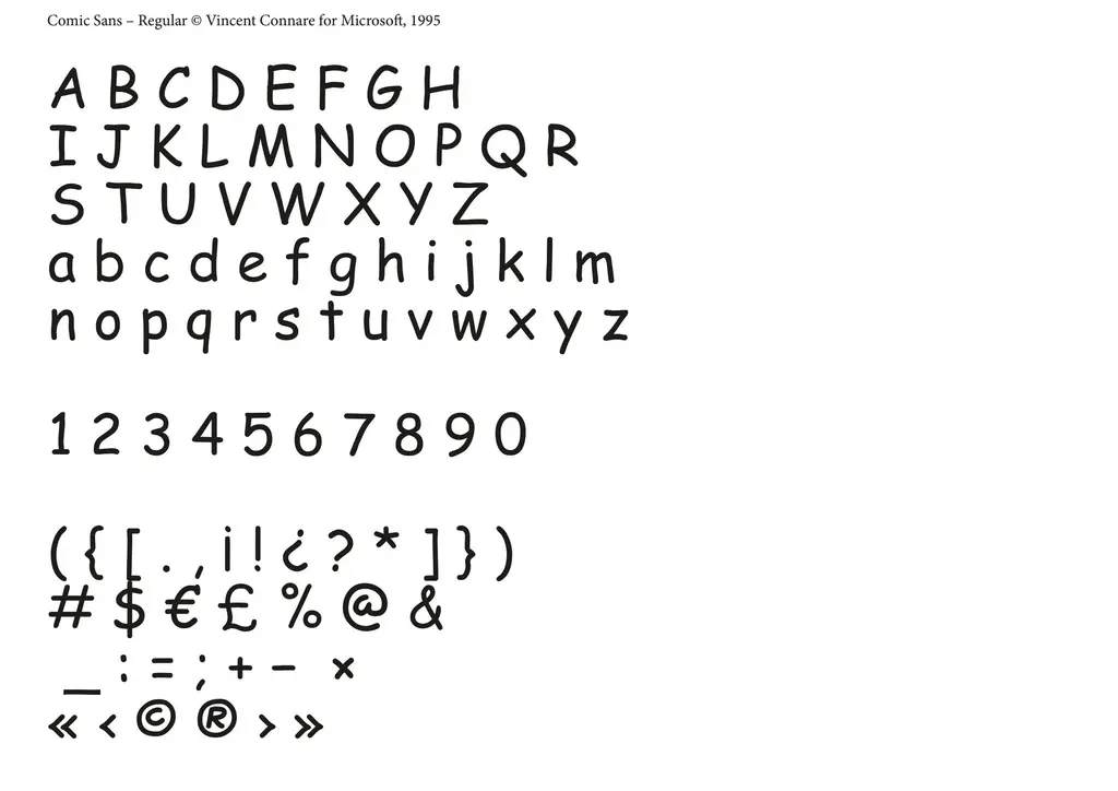
For our latest print issue, featuring The Little Mermaid star Halle Bailey, we commissioned graphic design studio Eurostandard to refresh what’s probably one of the most polarising typefaces out there: Comic Sans. Used across the entire mag in vibrant rainbow colours, we even went so far as to reimagine THE FACE logo in that curly, cartoonish cursive.
Most often associated with kids’ books or elementary school PowerPoint presentations, Comic Sans is the kind of typeface you’d see on a poster pinned to the wall in a doctor’s waiting room, advertising a local cooking class or maths tutor. There’s something playful and childlike about Comic Sans, yet it always elicits a strong reaction. Whether that’s excitement or discomfort, we’ll leave up to you.
“Creating a full typeface inspired by the infamous Comic Sans was obviously a challenge,” say Eurostandard, who are based between Paris and Lausanne and founded 2015 by Ali-Eddine Abdelkhalek, Pierrick Brégeon and Clément Rouzaud. “We like to hijack symbols and cultural gimmicks, so proposing our own version of a classic typography known by all, adored by some and despised by others – what could be better?”
And so the Eurostandard team gladly took on the challenge of subverting American type designer and Microsoft employee Vincent Connare’s 1994 creation, itself inspired by comic book lettering and designed to feel friendly and approachable for younger users. (Comic Sans remains widely used in schools, and praised for its legibility – especially for students with dyslexia).
“As this is a typeface based on handwriting, we made several attempts to draw it by hand,” say the designers. “Not being quite satisfied with our tests – they were too linear, considering it’s such a naive typography – we worked with a friend’s seven-year-old child, which helped inject a sense of spontaneity into it.” ComicFace was born.
The Eurostandard team were also behind the custom typeface used in THE FACE’s sold out Winter 2022 issue, starring Jenna Ortega. Against an electric backdrop of neon green, a dramatic gothic typeface – GothicFace, to be exact – graced every page of the print magazine.


“It was a matter of balancing legibility with the cryptic look that comes from layering two typefaces together,” they say, describing the overall result as “devilish”, “aggressive” and “ornamental”. Quite the polar opposite to ComicFace, then. But why is Comic Sans such a controversial font anyway?
“It’s divisive, which is exactly what makes it strong,” Eurostandard explain. “For example, if we think of Helvetica as an iconic font, then Comic Sans is iconoclastic because everything it conveys is the opposite of Helvetica. In that sense, feeling positive about Comic Sans could be seen as bad taste, while feeling negative about it could be interpreted as snobbery. In any case, what’s important is that it provokes a reaction.”
As for what makes a genuinely great typeface, Eurostandard don’t have a specific formula. What matters most is that it isn’t boring and can stand the test of time. “Our least favourite typefaces are ones that provoke zero reactions!” Too right.
