Lo-go: how menswear got plain and simple
If the latest menswear shows are anything to go by, logos are on their way out. The hypebeast has grown up, and wants quiet functionality instead.
Style
Words: Jacob Negus-Hill
Logos are an easy selling point. Everyone knows what you’re about, what team you support, how much you’ve spent.
Sure, this was great when you were 13 and camping out for the latest streetwear drop. But what happens now that you’ve become a fully-fledged adult? Do logos still hit the same? Not according to the latest menswear collections, they don’t.
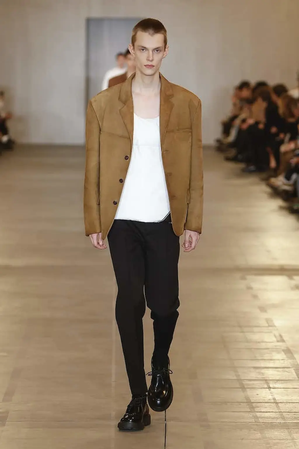
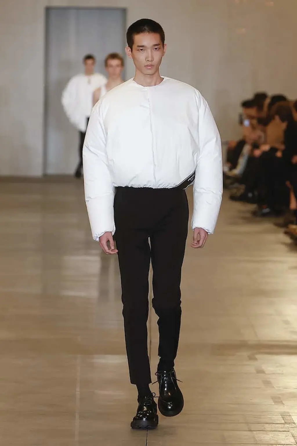
It’s time to let-go the logo in favour of a subtler approach. In January’s menswear shows, a sizeable chunk of designers – who have all played around with their house’s respective logos over the years – pared things back. Dior presented chunky cable knits, sheer vests and airy tailored trousers. At Prada there was razor-sharp tailoring, pop-coloured collars and a pillowy bomber with the house’s discreet label stitched on the edge. And there were little, if any, sightings of logos in Givenchy’s grunge-heavy collection, too.
Swedish brand Our Legacy has been subverting menswear staples for 15 years now, with logo-less sheer shirts, leather trousers and oversized knits as an established part of its DNA. Earlier this year, the brand’s founder Jockum Hallin reported a huge 80 per cent sales increase in the years 2021 – 2022. A logo-less windfall? Certainly, in a post-Covid world, longevity and function are often cited as being at the forefront of buyers’ needs. It seems the kids, now adults, don’t want brash logos anymore. They want design-driven, top-quality basics. Pieces you have to work a little bit harder to recognise. Right?
Fashion writer Charlie Porter, whose new book Bring No Clothes: Bloomsbury and the Philosophy of Fashion is published in September, knows all about the history of the logo. As he sees it, its relatively simple and explicit nature has, for almost four decades, “been grounded in subversion and defiance.


“In 1984, Bernard Arnault bought Dior for a franc. In the ’90s, Gucci was a joke. It was outsiders who imbued these brands with new energy,” explains Porter. “John Galliano at Dior, Nicolas Ghesquière at Balenciaga, Tom Ford at Gucci – they embraced and exploited how naff their logos had become. And the joke became the cash-cow.”
That was then, albeit a “then” with a long afterlife. Little wonder, perhaps, that Harry Fisher, the founder of Htown, an East London-based store which features highlights from Martine Rose and Mowalola, has mixed feelings about logos: “Customers seem to have the idea in mind that they only really want to wear a logo if it’s of a high luxury brand. Luxury brands are all about status.”
Porter shares similar thoughts, flipping on its head my question about whether luxury brands will always be logo-driven. “Luxury brands will always be profit-driven,” he retorts.
Htown is not just a shop, but also an agency that sells clothes to major stores worldwide. “Stores are less keen on products that are overly branded,” says its founder. “Monograms, unless you’re a major brand like Gucci, are not working well.” It’s also important to note Htown’s latest brand welcome: Our Legacy.
When I mention the Our Legacy statistic to Porter, he preaches caution. “I’m sure these customers are happy to have a Nike swoosh, a New Balance N or a Veja V on their feet, so I wouldn’t read too much into this.” And he’s right. Yes, people want design-led basics, but certain things are set in stone. In between all the clean-cut silhouettes poking from underneath a knitted cardigan, a well-placed swoosh or red tab is a sartorial statement embedded in menswear. And that’s still the same language all the streetwear kids have learned to speak – it’s just taken on a different accent since growing up.
“People want to present logos or details that define themselves without, at the same time, feeling out of touch”
There’s a tension here. Logos are powerful ways to make simple declarations. They speak, project even, on your behalf. But at the same time, you don’t always want everyone to know what they’re saying.
Rory Griffs, one half of Orienteer Mapazine, recognises a similar thing. “Looking back at ’80s Versace, its bold patterns and colour palettes are brand synonymous,” he says. “What’s interesting here is that different subcultures adopted the different ways that brands presented themselves.”
Meaning: one group feels comforted by a monogram, another by a specific design detail. It’s just about moments in time. Even now, wearers of Stone Island, the brand where getting the badge in has been memed beyond belief, have subverted the badge by, well, removing it. Two Stoney buttons with no badge signify Stone Island in a subtler way than the compass does.
There’s an element of customisation here which is often overlooked. People want to present logos or details that define them without, at the same time, feeling out of touch. Even across the Atlantic, American trends differ from English ones. Streetwear in the US is all Aimé Leon Dore while here in the UK, we’re all Arc’d up. In France, there’s a cult-like worship of sportswear, as tracksuits, Nikes and Asics are blended with Gucci caps and Prada Cups. You only need to look at the success of Corteiz in the UK to know what a logo can do: it commits you to a movement.
Trends come and go, and the bolshy logo will no doubt rear its head right back around. But, for now, how logo will you go?
