How the art director of ‘The Doom Generation’ created its look

Art director Michael Krantz recalls the head-spinning days of putting together the sets for Gregg Araki’s Gen X road movie.
Culture
Words: Trey Taylor
Nothing looks exactly like The Doom Generation, a “heterosexual” road movie by Gregg Araki made on a Party City budget. It was rife with facetious dialogue (e.g. “Look, you fucking chunky pumpkinhead”) and low-rent costumes (Amy Blue’s transparent coat inspired Patrick Bateman’s murder getup in American Psycho). To offer a sense of what takes place during the 83-minute runtime of this Gen X Bonnie and Clyde, the first three plot keywords on IMDb are pubic hair, fellatio, and threesome. That just about sums it up.
As lovers, Amy Blue and Jordan White hit the road, they recruit another companion in Xavier Red, and explore their sexuality across the beds of the most visually stimulating motel rooms and bathtubs. But the over-the-top sets are what made the apocalyptic film memorable. An example: it opens with a club sequence and pans across a massive sign with the words “Welcome to Hell” cut out, backlit by dancing flames. Then there is the black and white checkered motel room that has been all but exhausted on Tumblr.
Style over substance was the custom in New Queer Cinema, and Doom Generation art director Michael Krantz helped to conceive it. In the ’90s, eccentric production design – houses the colour of Necco wafers (Edward Scissorhands), graffiti-tagged apartments (SLC Punk, St. Elmo’s Fire) or pool parties with actual icebergs (Less Than Zero) – was somehow the norm. Back then, we had tin foil and plywood. Now, we have CGI. Araki tasked production designer Thérèse DePrez and Krantz with arts-and-crafting his obsessive vision for the second installment in his Teenage Apocalypse trilogy. (The other two films are Nowhere and Totally F***ed Up.)
Krantz, now 51, came to the movie not too long after entering the business via a stint doing construction. Together with DePrez and a few assistants, they worked tirelessly with a petty cash budget to create The Doom Generation’s unforgettable designs, including the Lincoln Continental the threesome drove, the dinosaur drive-thru and the doomsday messaging that appeared on billboards and in corner shops.
Here, Krantz breaks down what went into five key scenes of this visionary cinematic diorama.
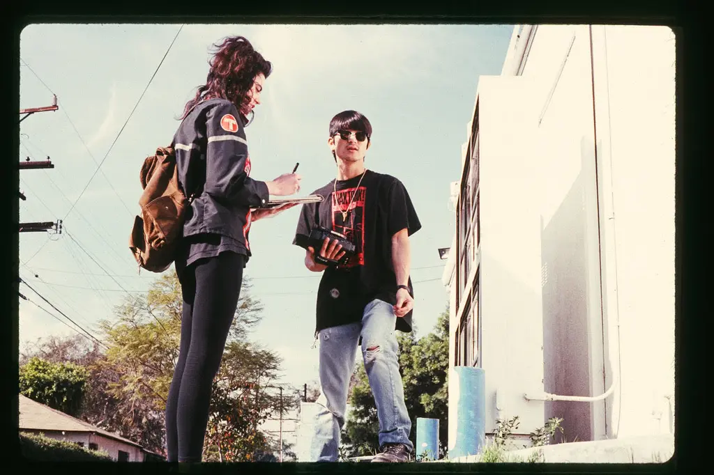
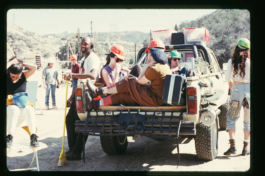
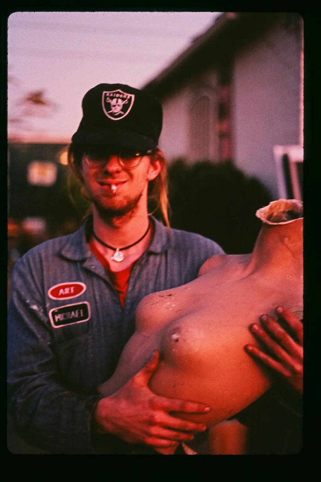
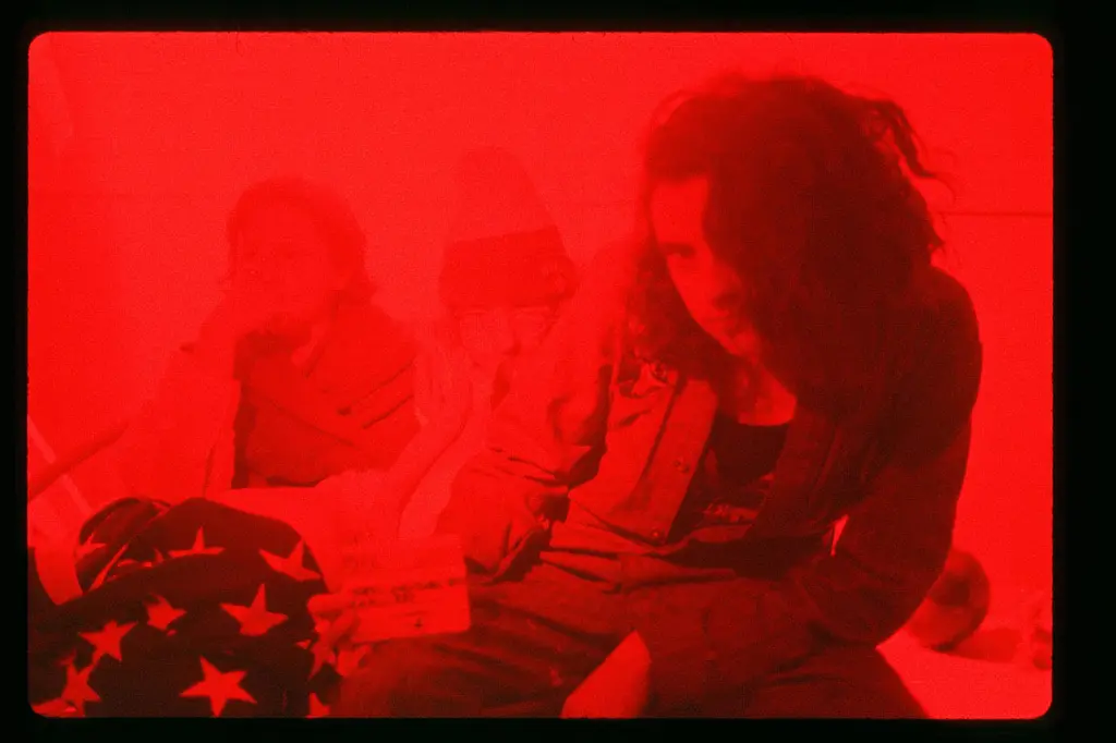
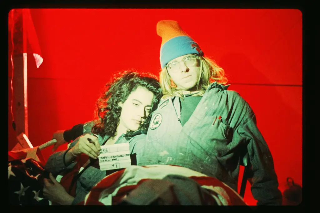
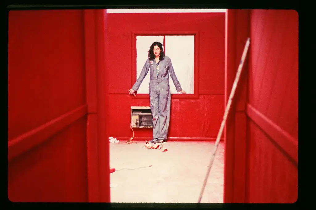
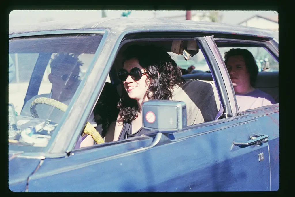
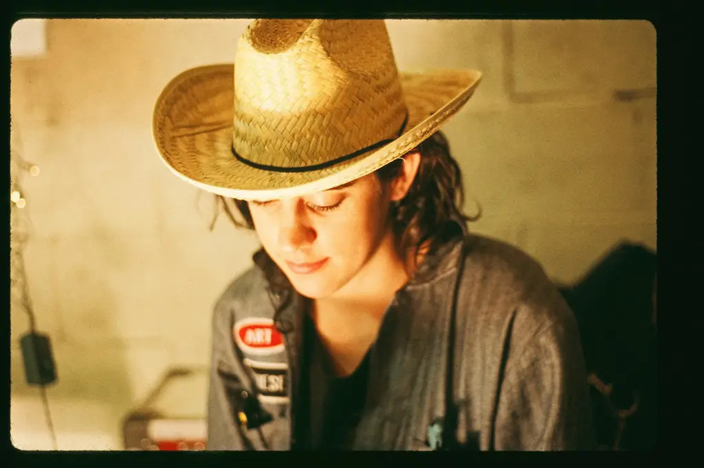
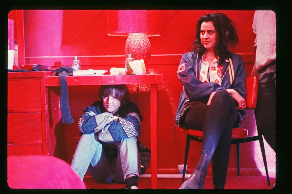
Behind the scenes photos by cinematographer Jim Fealy
The black-and-white checkered motel room
“The checkered room was not something that was scripted or really discussed beforehand. I think Gregg came up with it. He just shot it from the hip and I remember being in the studio and we had built and primed the set. I remember Thérèse saying he wants to make it checkered. And then Gregg saying, ‘Yeah, everything checkered.’ Like everything. We found whatever we could that already had a checkered pattern on it but there wasn’t a whole lot of things. There were towels or matches or an ashtray. I think we painted an ashtray. But then we just went about mapping out the grid on the walls the old-fashioned way. We did it with tape and with snap lines and pencil and then we just went through the process of painting it by hand. I remember a lamp in particular. That was kind of classic, a late mid-century style lamp with a shade and it had a skinny neck and a bowl at the bottom – something you might find in any motel from the ’60s or 70s. There was so much to do and it took forever. The checkerboard took two or three or four of us a few weeks to do that. It was so incredibly labour intensive.”

The Lincoln Continental
“A big prop for the movie was their car. So we looked in the paper and we found it: a 1968 or ’69 Lincoln Continental. It was 19 ft. 8 inches long. It was gigantic. I don’t remember the original color. Maybe it was tan or something. We brought it back to the shop and we started systematically ripping everything out and doing our crappy reupholstery job and pulling T‑shirts down over the bucket seats. We gave it a really crude paint job where we actually rolled on paint for the exterior. Normally when you’re doing a show where a vehicle plays such a big role, you have more than one car because you don’t want to chance something happening to it. We didn’t have that luxury.”
The carnoburger drive-thru
“It was the drive-thru burger. It had a big dinosaur head that you’d speak into for your order, which we sculpted out of foam. I think [production designer] Thérèse [DePrez] may have done that piece herself. We got some block foam and she carved it, made the teeth and then we probably had somebody paint it. We did this in an arts and crafts studio. We made everything ourselves. But I remember driving that day. We didn’t have a stunt driver. I did a lot of the driving myself. I remember driving for a scene when they go to Carnoburger and Amy was in the driver’s seat and she yells something out the front of the car and she’s sitting on my lap; I’m bent over to the side and just step on the gas as hard as I can and make a right hand turn but I’m below the dashboard. I cannot see where I’m going. She needs to be leaning out of the car and she couldn’t reach the pedal. I mean, we broke every rule conceivable. It was a non-union job so we didn’t have to really play by a lot of the safety rules. We should have, certainly, but we didn’t. We just did what we had to do.”

The red room
“The red room was actually painted. We did a couple of layers of regular house paint and it wasn’t red enough. So we ended up buying big, 10 gallon buckets of bullseye red enamel sign writer paints like what you would use to handpaint a sign because it’s Marlboro Red. I remember Thérèse saying she wanted them to be the colour of my cigarette pack, because I smoked Marlboros back then. I wanted it to be that colour. It took a long time to find that exact depth of chroma. So we brought in somebody with a spray gun to help get some of that stuff on the walls quickly. It sprayed everywhere around the studio and everything had a sort of red tint to it after that.”

The apocalyptic signage
“We made so much signage and a lot of it was hand painted. We also made a billboard that we just stuck onto an existing billboard that was low enough for us to climb onto without getting permission. It was on San Fernando Boulevard. I don’t remember exactly what it said. I think it was ‘The Rapture is Coming’.”
The Doom Generation plays August 4th at the BFI as part of their Nineties: Young Cinema Rebels season.


